36 out of 100, across ten category leaders
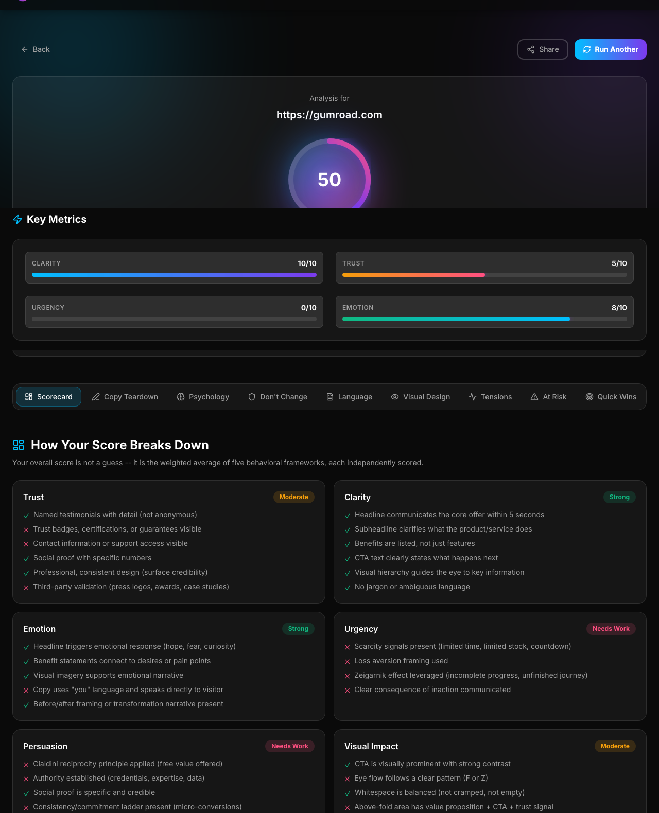
I ran ten of the most recognized SaaS landing pages through seven psychology frameworks. The average score was 36 out of 100. None of the billion-dollar brands broke 50. The winner wasn't Stripe or Notion. It was Gumroad, at 50.
The frameworks: Cialdini's seven principles of persuasion, the Fogg Behavior Model, Kahneman's System 1 and System 2, Stanford web credibility, a cognitive bias audit, friction mapping, and the trust ladder. All seven are the same lenses a CRO consultant charging $600-$2,400 per audit applies manually. You can find each framework explained in depth in our landing page psychology primer.
This post is the expanded cut. The scorecard, the pattern behind it, and three fixes you can ship this afternoon.
Here's how ten category leaders scored
| # | Tool | Score | Clarity | Trust | Urgency | Emotion | #1 Conversion Killer |
|---|---|---|---|---|---|---|---|
| 1 | Gumroad | 50 | 10/10 | 5/10 | 0/10 | 8/10 | Missing policies, pricing anchors, and guarantees |
| 2 | Supabase | 47 | 8/10 | 3/10 | 0/10 | 4/10 | No clear CTA expressing unique value over competitors |
| 3 | Notion | 41 | 5/10 | 3/10 | 0/10 | 4/10 | Value prop diluted by too many options and dense info |
| 4 | Lemon Squeezy | 41 | 7/10 | 2/10 | 3/10 | 2/10 | Weak trust depth and no clear action triggers |
| 5 | Linear | 34 | 8/10 | 3/10 | 0/10 | 2/10 | No proof, no pricing, no reason to act now |
| 6 | Stripe | 34 | 7/10 | 2/10 | 0/10 | 2/10 | Lack of clear CTAs and defined value proposition |
| 7 | Cal.com | 31 | 7/10 | 2/10 | 0/10 | 2/10 | No trust signals or differentiating specifics |
| 8 | Carrd | 31 | 8/10 | 2/10 | 0/10 | 0/10 | Absence of proof and urgency |
| 9 | Framer | 28 | 8/10 | 0/10 | 0/10 | 6/10 | Trust and rational evaluation underpowered |
| 10 | Vercel | 25 | 5/10 | 2/10 | 0/10 | 0/10 | Lack of differentiation and compelling value propositions |
Average: 36.2 out of 100. Highest: Gumroad at 50. Lowest: Vercel at 25 (a $3.5 billion company). Framer, a design company, scored zero out of ten on trust. Nine of the ten scored zero out of ten on urgency.
Gumroad talks to a human. Stripe talks to a buyer.
Open Gumroad and it tells you, plainly, that this is a tool to help you make money and it is dead simple to do so. One idea. One audience. One person on the other side of the screen.
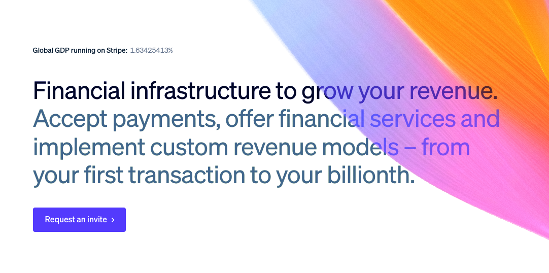
Open Stripe and you get "Financial infrastructure" (what does that even mean?) plus a grid of everything the company does. Payments, billing, tax, connect, atlas, climate. A procurement committee can navigate that. A curious founder can't. The page is talking to a buyer in a boardroom, not a human with a problem.
This is a Kahneman System 1 failure. When a visitor hits your page, the gut fires before the analytical brain engages. Gumroad's hero lands as "this is for me." Stripe's hero lands as "this is for someone more important than me." The second reaction is fatal before the visitor has read a single body paragraph. More on why the hero section does so much of this heavy lifting in our guide on what should be above the fold.
Gumroad knows its audience. Stripe is trying to be seen by every audience at once, so nobody feels seen. The irony: Stripe can afford that. You can't.
The scoring reflects this. Gumroad's emotion score was 8 out of 10, the highest in the study. Stripe's was 2. Clarity was 10 out of 10 for Gumroad and 7 for Stripe. Both companies have elite design teams. The difference is not craft. The difference is whom the page was built for. Gumroad wrote their hero for one specific person (an indie creator trying to make money online) and then trusted that narrowness to sell. Stripe wrote theirs for every CFO, every developer, every platform team, and every procurement lead simultaneously, and ended up speaking to none of them in particular.
Pre-sold traffic hides bad pages. You don't have that cover.
Here's the strategic insight most teardowns miss. Stripe, Notion, and Vercel can get away with a weak landing page because their visitors are pre-sold before they land. Years of reputation. Ad budgets in the eight figures. Every VC deck and every developer conference name-dropping the brand. By the time a visitor types the URL, the decision is almost made. The page just has to not fumble.
You don't have that cover. When someone lands on your page, there's a good chance it's the first time they've heard of you. The landing page is the entire sales pitch. Every word has to work. Every section has to build the trust that Stripe gets handed for free.
That sounds like bad news. It isn't. Being smaller has an edge. You don't have a hundred approvals, a legal review, or three managers on top of three managers. You can change your hero section this afternoon and ship it tonight. You can run an audit, flip benefits into losses, and see the data shift within a week. Stripe can't do that. Nobody at Stripe can touch the homepage without a committee.
The landing pages of billion-dollar brands are not the right template for yours. They're the worst possible template. They're built on assumptions you can't make. Stripe's page assumes the visitor already knows what Stripe does. Notion's page assumes the visitor has seen the product in at least three places before landing. Vercel's page assumes the visitor is a developer who has already compared the options. None of those assumptions hold for a bootstrapped SaaS with 400 visitors a week and a two-sentence product description.
Nine of ten scored zero on urgency
Not low. Zero. Nine of these ten pages give a visitor no reason to act today instead of next quarter. Cialdini's scarcity principle, one of the seven most reliable persuasion triggers, is left on the floor.
The objection is predictable: urgency feels scummy. Fake countdown timers. "Only 3 spots left!!" when there are thousands. Dark patterns that erode trust the second a visitor notices. Fair. Those tactics should stay dead.
But urgency doesn't require lying. It just needs a real reason to move this week:
- Beta pricing with an actual date it goes up.
- First-N bonuses only you can deliver while you're still small (a setup call, an audit, a starter template).
- Cohort-based access. "Next round opens Monday, November 3."
- An expiring extra at signup. 30 days of priority support, a template pack, a second audit.
Of the ten pages in the study, only Lemon Squeezy scored anything on urgency (a 3 out of 10). Not because they used a timer. Because they gave a concrete reason the action mattered now.
Urgency is the cheapest lever on the page. A real date, a real bonus, a real constraint. If you want the full playbook, see how to add landing page urgency without feeling scummy.
Framer scored 0 out of 10 on trust
This one is the counterintuitive finding of the study. Framer, a design company whose product is making beautiful web pages, scored zero on trust.
Beautiful hero. Smooth animations. Considered typography. And no proof of any kind. No named customer. No specific outcome. No press logo. No case study link. No testimonial with a face and a number next to it. The page assumes you already trust Framer because the page looks expensive.
That's the Stanford web credibility mistake in a single data point. Surface credibility (polish, design, first impressions) is maxed out. Earned credibility (free tier, sample outputs) and reputed credibility (press, third-party endorsements) are empty. Most pages over-invest in the first type and under-invest in the other three. Framer just made the mistake more visible.
If the design people aren't adding proof, it isn't "too obvious to mention." It's just missing. For a practical fix list, see how to improve landing page trust.
Three fixes for your own page, an afternoon each
You don't need a redesign. You need three changes that align your page with how people actually decide. Each one takes an afternoon. All three are rooted in the same frameworks the study used. Our full breakdown of the causes behind poor conversion rates lives in why is my landing page not converting.
1. Write for one person, not a department.
Rewrite your hero to sound like you're talking to one specific human you already know. Their job, their stuck-point, the outcome they care about. Cut "businesses of all sizes." Cut "teams and individuals." Pick the one person and speak to them. Cialdini's unity principle works only when the reader feels the page was built for them specifically.
2. Add three named testimonials with specific results.
Not "trusted by thousands." Not a row of logos with no context. Three real people, three real names, three specific outcomes with numbers. "Cut our onboarding from 14 days to 3." "Closed four deals in the first month." Specific beats impressive. A testimonial from Jane at an unknown company with a real number outperforms a logo wall from Fortune 500 brands every time.
3. Flip benefits into losses.
Swap "Save 10 hours a week" for "Stop losing 10 hours a week." Swap "Increase conversions by 20%" for "Stop leaking 20% of your traffic." Same fact, about twice the pull. That's Kahneman's loss aversion, free. Walk through your page and find every gain-framed benefit. Rewrite half of them as losses prevented. Measure what happens.
Frequently asked questions
Why is Stripe's score so low if they're so successful?
Because Stripe's success is not the landing page. Most Stripe visitors have already heard the name from their developer friends, their investors, their last three podcast sponsors, or their last SaaS purchase. The page is confirming a decision that was already made elsewhere. Your page doesn't have that cover. Copying Stripe's minimalism copies a strategy that works only when the rest of the funnel is doing the selling.
Does AI scoring actually match human CRO consultants?
On these ten pages, the scores tracked what experienced CRO consultants independently flagged as the biggest issues: unclear value props, missing proof, no urgency, generic hero copy. The frameworks are the same ones consultants use. The difference is speed and price. A consultant takes two weeks and charges $600-$2,400. The audit tool takes about a minute. The judgment call (what to fix first, how to rewrite) still lives with the human who reads the report.
How do I run this same audit on my own page?
Paste your URL. Wait about a minute. You get a score across clarity, trust, urgency, and emotion, your biggest conversion problem, and a few ranked fixes. If something in the report doesn't apply to your audience, ignore it.
Is a score of 36 bad?
For a category leader with pre-sold traffic, a 36 is survivable. For a bootstrapped SaaS or a solo founder with cold traffic, a 36 is a bleeding wound. The same page gets different treatment depending on who lands on it.
Further reading
- Landing page psychology: the 7 frameworks that drive conversions. The full breakdown of every framework used in this study.
- Why is my landing page not converting?. The seven root causes behind low conversion and how to diagnose each one.
- How to add landing page urgency (without feeling scummy). The playbook behind the urgency section above.
The tool that ran every audit in this study is Conversion Probe. Paste a URL, get the score and your biggest problem in about a minute. Free, no signup. The Pro report is $29.